A new year always comes with reports of new trends in everything, be it fashion, food…or lobby and common area design in residential communities. Furnishings and design, like clothes, are the subject of style and vogue that morph and change from season to season and year to year. When it comes to common areas, trends cover everything from paint colors to fabric choices to how a space is laid out. So what’s coming in 2024?
COVID is “Over”
While cases of covid are still cropping up, and masking and other public health measures remain visible in many places, like the 1918 Spanish flu pandemic a century ago, people are moving forward from the dark days of the more recent global health crisis.
Perhaps the most prominent trend in lobby design this coming year is that finally after almost four years, covid is no longer the driving force in decision-making for co-op, condo, and HOA boards in terms of evaluating, redesigning, and using their common spaces, including lobbies, amenity spaces, and club houses.
“We were living in isolation since March 2020,” says Marilyn Sygrove, the principal of Sygrove Associates Design Group, a design firm located in Manhattan with clients throughout New York and New Jersey. “During the pandemic, seating was ripped out or lobbies, protective screens went up between staff and residents and guests. There was no gym usage. Everything was cleaned constantly. All that’s gone now. We are back to normal as if it never happened.”
“People of tired of the whole pandemic thing,” says Sygrove. “They don’t want to remember it. They want to go back to a communal feel. Lobbies are becoming more multi-purpose. Boards and committees are asking me to carve out areas where they can have a meeting space for instance, with a broker or a contractor. They want a space in the lobby for that type of thing.” Another factor is personal security.” Many single people who live alone “would rather have a safe space to meet in the lobby, rather than take people they don’t know into their homes.”
Color Palette Trends
A major factor in redesigning lobby spaces is color. Traditionally, neutral tones were the standard choice. (Think hotel lobby.) That’s still true to some extent, but with some refinements for 2024.
Sygrove gives us a more rounded view of the overall situation. Trends are for new buildings, she explains; existing boards tend to be more cautious when making changes. “They don’t want to offend or overstate,” she says, “so, trends are not really in the language for us. With that said, gray is gone. People are sick of it. There are a thousand kinds of white, and that’s usually what a board will choose. When I started many years ago, green - particularly forest green - was a good color for lobbies. Today’s green has some gray in it to tone it down, so it’s not offensive to anyone. It’s become the ‘new grey.’ There are other interesting colors like deep eggplant that are also popular as accents.”
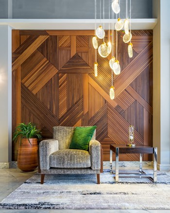
“Use of color also has to do with how the lobby is laid out,” Sygrove continues. “Walls and floors still command a more neutral palette with color introduced by seating accessories and artwork that can be easily switched out. This way you can refresh a space more frequently. You don’t need to replace everything, just the seating, accessories, artwork etc. There is also a trend to more organic and plant based materials in seat and floor covering.”
A Sense of Place
Good design often includes a sense of subtlety. Sygrove explains that she will often look around at the setting for the building or community for inspiration. To bring the outside, in.
“For accents, I mostly depend on the history and vintage of the building and its surroundings,” says Sygrove. “Is the building near water, for instance? In that case, the residents will often want to incorporate blues. This approach gives a sense of place. If we are near a park, I’ll suggest greens and browns, and autumnal colors too, like reds and oranges. The goal is to give the building a personality.” In an age of cookie-cutter glass-and-metal architecture, establishing that personality and point of view not only appeals to current residents, but to prospective buyers as well.
Who’s in the Driver’s Seat?
One must assume that any time a board hires a designer they have vetted them entirely relative to their work, performance, etc. But what if the board has some very set ideas about its design future that the designer doesn’t see as the optimal choice? Maybe they're still stuck on forest green? “The idea of trust comes into play with hiring professionals,” says Sygrove. “If a building’s board or design committee wants something I think is over the top, I tell them - but ultimately, the decision is theirs. I do what they want, but I hope they will take advantage of my years of experience.”


Leave a Comment