
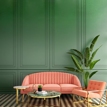
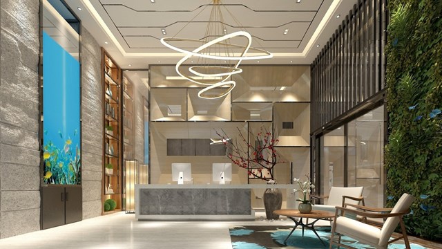
Design is what makes the difference between a space looking like a seductive boudoir… or the interior of a cardboard box. Neither may be appropriate for a co-op or condo lobby, but somewhere in between lies the comforting, welcoming common space we hope to encounter when we arrive home. The key to creating that welcome lies largely in the use of basic elements of color, texture, and light. While all three interlock to create a unified, coherent aesthetic, color is at the heart of the puzzle.
Defining Color & Palette
“Words are always a challenge for designers to describe when seeking to create a specific mood,” says Marilyn Sygrove, principal of Sygrove Associates Design Group, based in New York City. “One person’s ‘dark’ is another person’s ‘rich.’ One person’s ‘light and bright’ is another person’s perceived maintenance nightmare. So we have to be sensitive to the perceptions of our clients. It is all about balance, and selectively choosing what can be used effectively, and where. Accent walls, floors, a piece of furniture, a desk are also to be weighed against wear and visual impact.”
A community’s population can heavily influence its color preferences; so can its location. “Beachfront condominiums often like to reference watercolors and sunsets,” says Sygrove. “Urban communities generally like more edgy combinations, or subtle neutrals with deep, rich contrasts. We are definitely seeing colors that reflect a ‘sense of place’ reflecting the geography surrounding the property, whether parks or riverfronts, especially in special setbacks with respect to their landscaping.”
Ethelind Coblin, architect and principal of Ethelind Coblin Architect, a New York City-based design and architecture firm with clients throughout the Northeast, says, “To ‘lift’ the space, we incorporate light metallic finishes in the upper tray. Generally, our use of color is spare and restrained, minimally incorporating it in artwork and accents, such as pillows, etc. Our goal is creating timeless public spaces such as lobbies, halls, community spaces, instilling a sense of restraint and serenity.”
Restraint and balance are key, agrees Liz Morehouse of Manhattan-based Morehouse Design Associates, Inc., who has designed residential properties in New Jersey. “Recently I walked into a building lobby that was trying to make a really contemporary statement,” she says. “But they had used so much white that you felt like you were walking into a hospital. It had no warm friendly feeling; it was just very sterile. So you don’t want to overdo white, but by the same token you don’t want to overdo gray… it’s too somber. You really just have to mix it up.”
Mixing it up is a combination of art and science. “People respond more favorably to warm colors,” says Morehouse. “In a hallway, I might pick a warm beige carpet with an accent of a crisp blue color, a combination of the warm with a brighter color. In a lobby, I might do a sofa in a warm color, but then I’ll put a pop-up color on a throw pillow. And with area rugs, you can mix a whole lot of colors for a lobby, almost like a mosaic tile. So I would mix warm and cool colors.”
“I have a theory about color,” says Cathie Daly, president and principal of Design East, Inc., in Medford. “You can’t afford a color that is not timeless. When you walk into a building, it has to look timeless and great not just today, but five or 10 years from today. It has to have a long-term investment and it has to be sophisticated, yet approachable, and have a level of taste that crosses over generations and genders.”
Influencing Factors
In addition to location and population, the very type of construction and the age of a building can have outsized effects on design considerations. Some color combinations and textures work well in prewar buildings, while others are preferable for postwar structures, and the newest, most modern buildings may require a whole different approach.
“Each building, each location, each period of architecture, and each building’s population are different and deserve to celebrate those differences,” says Sygrove. “We work very hard to individualize each building and not fall into the ‘cookie-cutter’ category, or to offer only one particular designer’s ‘signature’ look. We design each property individually but stress the commonality of the residents in their selection of their building in its specific location. This is the first layer of ‘glue’ to any project. We then design from there based on color preferences from the population or our recommendations. Every one of our clients wants something that looks timeless, classic, clean, durable, and easy to maintain. These factors are the core requirements.
“Often,” explains Sygrove, “prewar buildings have wonderful, amazing ‘bones’ for us to work with—natural marble, mosaics, tiles, metal finishes, grillwork. Many already are a neutral color shell, and we can add discreet pops of color in a chair or bench that give it an interesting yet elegant twist. By the use of color and clean lines, we can make a prewar building appealing to younger buyers. When working in more modern buildings, it is all about simplicity and the elegance and perceived value of the materials used and the richness of color. We would either embrace a large bold pattern as a focal point, or a deep rich color to contrast with light-colored, easily-cleaned materials.”
Coblin adds that “Prewar buildings tend to have higher-end finishes, so we generally choose to enhance those terrazzo, stone, and panelized finishes. It’s a fine juggle to update these already highly-designed spaces. Postwar structures actually allow designers a bit more freedom. Often, they are in poor shape, have a mix of classical and 1960s detailing, and are in grave need of a new design aesthetic. We see postwar buildings, with their modern exterior and structure, as a chance to develop an equally contemporary interior.”
Sygrove also suggests that regardless of building type or vintage, organic combinations are very popular now—natural woods, textures, stone references, and overall organic patterns. Also, fresh updates to period buildings with art deco, mid-century modern, and neoclassical architecture are now paired with modern interpretations of these styles and colors that are fresh, while still respecting the architecture of the building, either embracing it or playing with it for a contemporary spin.
Morehouse has the same life span in mind. “Usually you live with a hallway theme for 12 to 15 years,” she says. “So you need to think in terms of colors that you’re not going to get tired of. Usually, in hallways and common spaces, you keep it kind of neutral, but still have an accent color. If you keep a warm base, you can still have a brighter splash of something—but stay away from the bright reds and oranges,” she says. “For a while, forest green was a popular color, and that’s out of style now. Colors do vary from year to year, but you want to stick with classic colors.”
Working with the Board
“We spend a lot of time with our boards and design committees,” says Coblin. “These spaces we are designing are their public spaces, individual to them. It’s important that they understand the design approach we are using, and the related color and finish options. The board and residents need to buy into the aesthetics as uniquely theirs. That is why each of our designs is exclusive.”
“We have an organized and efficient approach to interface with the board and the resident population when designing for them,” concurs Sygrove. “We not only listen to the board, but also help the board listen to the shareholders or unit owners so that everyone has a voice in the project. The bottom line is that we listen, and that can take many forms to get to the right place. We know that not everyone will be happy with any single design, but they do appreciate having a voice. We try to design to the majority.”
Interestingly, Sygrove also reports that in their specialty design niche—designing for cooperative and condominium communities—they listen very carefully to the board, design committee, and residents. They find that the overwhelming majority of their clients request ‘neutral’ colors—the definition of which has changed over the years from warm beiges to cool grays and gray-greens. “These are the ‘safety’ default color basics that we work from,” Sygrove says.
Coblin also notes that at the moment, the overall color environment is particularly subdued. It is tastefully incorporated in a way that can be changed while the basic framework of a design scheme is timeless and neutral. “The use of color is to enhance the overall design of the space,” says Coblin. “It helps us make a space feel taller, grander, and for longer lobbies, the gradations of intensity help us modulate, add rhythm, and improve the overall look.”
“Looking towards the future with every design we develop is the fun of it,” says Sygrove. “Pushing towards the long term rather than just the present. We advise buildings to spend their money on quality, because quality is the universal. I always use this example: You can buy a can of paint with a color that looks ‘cheap,’ or you can spend that same amount of money on a can of a paint color that looks rich. That is where the design talent comes in; selecting that timeless, classic, delicious color that affects the mood of every person who walks into the lobby or halls—whether fresh, or soothing, or neutral.”
In the final analysis, using color and texture and accompanying elements to design that welcoming space is the art of design and the art of designers. But as each building is different and individual, it is critical that the residents and their board be not only on board with the choices, but directly involved with making those choices. Design is conceived and born of the right interface between building, designer, and residents.
A J Sidransky is a staff writer/reporter for CooperatorNews, and a published novelist.


Leave a Comment