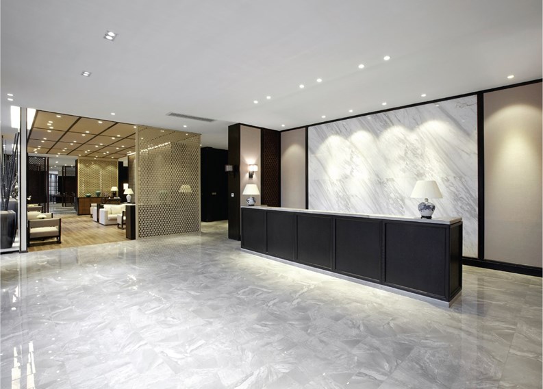
The lobby of a resident’s building is the first thing a shareholder, unit owner, guest or prospective buyer notices when they come through the front door. That said, it stands to reason that comfortable, appropriate lobby furnishings are a very important part of a co-op, condo or homeowner association’s presentation and appeal.
Lobbies, hallways, and other common areas are, of course, more than just utilitarian transitional spaces. Boards are best suited to stay abreast of what’s trending in common area aesthetics; after all, from time to time, an update to a lobby’s appearance must occur.
Getting Started
This process can morph into a nightmare quickly. First, a designer must be selected; since most fancy themselves as experts of interior design, many push for their referrals to do the job. “The selection process can be brutal, because everyone has a friend or a decorator who they recommend,” says Marjorie Hilton, a designer and owner of Manhattan-based Marjorie Hilton Interiors, and former decorating editor of House Beautiful Magazine. “There’s often a beauty contest of fifty people who are trying out to design the same lobby.”
Other than an interior design death match, which would make good HGTV but probably runs afoul of New Jersey municipal law, how does one whittle down possible candidates? “The easiest thing to do is to choose an outside person who no one has a vested interest in,” Hilton suggests.
There’s the question of who will decide on a final candidate, as well. Smaller boards will make the decision themselves; larger ones are advised to form a committee for this purpose. Word to the wise, however, is to keep that committee at a manageable size.
“You have to keep the committee down to three people,” says Hilton. “If you have too many people, it’s a catfight. Everybody is saying, ‘I want modern! I want traditional! I want moldings! I don’t want moldings! I want chandeliers! I want recessed hi-hats…’ You get the picture.”
Once the committee gets cooking, they still have to peddle the plans to the rest of the shareholders and unit owners. “Look at the bones of the thing, talk to the committee members, and you finally get some idea of their thoughts,” says Hilton. “Then you set forth doing a couple of boards, and then the process becomes arduous again, because normally the committee puts the boards up in the lobby. There might be four boards, or six boards, and then it’s a catfight, and people are screaming at each other in the elevator.” Once that’s all done, however, the process gets a lot less arduous.
“A lot of the conversation takes place before you’re even hired,” says Joel Ergas, FASID, NCIDQ-certified and a principal of Manhattan’s Forbes-Ergas Design Associates, Inc. “You have to have an agreement, in principle, on design approach, on budget, on time schedules…that’s all pre-decided before you’re even signed up with the contract…when you go to contract, you’re following that roadmap.”
As in legislation, when everyone is a little unhappy, you know the job is right. “If you’re pleasing everybody, then something is wrong,” Ergas says. “That’s a bad place to start, trying to please everyone. Most of the people we work with are savvy enough to know this. They very often know up front who the troublemakers are going to be, so they’re ready for it.”
“We do a site-visit prior to meeting the board,” says Catherine Daly, president of Design East, Inc. in Medford. “I also want to know what’s within a 20- to 30-minute radius in terms of the competition and find out what other communities that are similar to that particular property have done. We recognize what the budget is, then we reaffirm what is a priority.”
Lobby Aesthetics
Hilton has a clear idea of what a lobby should be, existentially. “It just has to be really clean and functional,” she says. “You don’t want people lounging around in a lobby. I like benches a lot. I don’t like living room furniture in a lobby because then people get comfortable, and then they sit there. If you have a sleepy doorman at three o’clock in the morning, and you have a comfortable chair or a sofa, he’ll go to sleep. He might not be watching the door. You make it functional and attractive…but not too comfortable.”
Ergas agrees. “You don’t want deep lounge furniture in a public area, because a lot of people will sit in them and then can’t get out of them. Lobby furniture has got to be built for what they call ‘contract use.’ It’s not residential furniture. It’s proportioned and it’s constructed for heavy-duty use.”
In this case, function trumps form. “The perfect lobby is spare, clean, and uncomfortable,” says Hilton. “You walk through and you’re not enticed to sit down. You just get an aura of the circumstance, and that’s really all you want from the lobby.”
When it comes to the nitty-gritty, Ergas starts from the bottom. “You start with the floors, obviously,” he says. “We have done carpeted lobbies, but most of the time the lobby is stone or porcelain tile or some sort of a hard surface that’s easy to maintain and isn’t fragile.” Carpets are quiet…but you could have an office pool about when the first impossible-to-remove stain appears on that nice new rug.
Walls, too, are extremely important. “You’re always looking for where the public comes in contact with the walls,” Ergas says, “and that’s pretty much outside corners. If you see that’s a vulnerable spot, you start your design A: with a choice of materials, and B: with how you can protect those corners and still have it look like it was meant to be. Not like something that the super put up.”
Even buildings with limited budgets can make it all work if the money is spent in the right places. “You have to be very concerned about the lighting and the flooring,” Hilton says. “You can use paint effectively for a lower priced lobby and can get very good effects. But if you don’t have good lighting, you’re finished.”
These days, with LED lights all the rage, designers work around that mandate. “I like built-in lighting, because it’s easier to maintain, and it’s ambient light,” continues Hilton. “I don’t like lamps; I don’t like anything that a child can turn over, or that is a potential hazard. I like everything built-in. Lighting is number one on my hit parade list.”
Differentiate Yourself
You may think you have a good eye for design, and thus can do-it-yourself and remake the lobby. This is not advisable. Designing a lobby is like getting a haircut…it’s best left to the professionals. “The biggest giveaway on a do-it-yourself lobby is residential furniture that came from someplace like IKEA,” says Ergas. “It’s got about six months to live.”
As for the actual look of the lobby, that varies depending on the building. “It’s a big mistake to be totally safe and traditionally boring,” Ergas says. “A lobby has got to have some things that grab you. That may come with lighting, or decorative lighting, or some of the detailing on some of the materials. I pass some buildings and I say, ‘This looks like 20 others I’ve seen this week.’ You want to give it some identity… something that differentiates it. Maybe there’s a feature wall that no other building has. We’re doing a building now that has a two-story lobby. We’re using great stone material on one feature wall and a very large, over-scaled LED chandelier. And that will be an iconic element in that building. Most buildings couldn’t have it because it’s so large, and it’s filling up a two-volume space.”
At the end of the day, though, remember that, while a lobby is important for many reasons, it’s also not the same as the living room in your apartment. If you find yourself in a wrestling match about the future of your lobby, relax. It may not be as big a deal as you think.
“Most people don’t even see a corridor or a lobby,” says Hilton. “People who live in the building use it as a transportation vehicle, and they don’t even look. You can ask them if the flowers on the glass table are beautiful, and they’ll say, ‘What glass table?’ They pass it every day but they don’t see it. It’s not as important an issue, intrinsically, as we’d like to think it is.”
“Every building is unique architecturally and because of budget,” says Daly. “Our job is to maximize the building’s potential and for the design to be timeless and maintenance-free because that’s where the value is.”
Greg Olear is a freelance writer and a frequent contributor to The New Jersey Cooperator. Freelance writer Christy Smith-Sloman contributed to this article.


Leave a Comment