
Page 10 - CooperatorNews New Jersey Spring 2022
P. 10
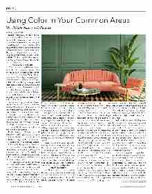
10 COOPERATORNEWS NEW JERSEY —SPRING 2022 NJ.COOPERATORNEWS.COM DESIGN Using Color in Your Common Areas The Palette Makes a Difference BY A. J. SIDRANSKY Design is what makes the difference be- tween a space looking like a seductive bou- doir… or the interior of a cardboard box. Neither may be appropriate for a co-op or condo lobby, but somewhere in between lies the comforting, welcoming common space we hope to encounter when we arrive home. The key to creating that welcome lies largely in the use of basic elements of color, texture, and light. While all three interlock to create a unified, coherent aesthetic, color is at the heart of the puzzle. Defining Color & Palette “Words are always a challenge for de- signers to describe when seeking to create a specific mood,” says Marilyn Sygrove, prin- cipal of Sygrove Associates Design Group, based in New York City. “One person’s ‘dark’ is another person’s ‘rich.’ One person’s ‘light and bright’ is another person’s perceived maintenance nightmare. So we have to be sensitive to the perceptions of our clients. It is all about balance, and selectively choos- ing what can be used effectively, and where. Accent walls, floors, a piece of furniture, a desk are also to be weighed against wear and visual impact.” A community’s population can heavily influence its color preferences; so can its location. “Beachfront condominiums often like to reference watercolors and sunsets,” says Sygrove. “Urban communities gener- ally like more edgy combinations, or subtle neutrals with deep, rich contrasts. We are definitely seeing colors that reflect a ‘sense of place’ reflecting the geography surround- ing the property, whether parks or river- fronts, especially in special setbacks with respect to their landscaping.” Ethelind Coblin, architect and principal of Ethelind Coblin Architect, a New York City-based design and architecture firm with clients throughout the Northeast, says, “To ‘lift’ the space, we incorporate light me- tallic finishes in the upper tray. Generally, our use of color is spare and restrained, minimally incorporating it in artwork and accents, such as pillows, etc. Our goal is cre- ating timeless public spaces such as lobbies, halls, community spaces, instilling a sense of restraint and serenity.” Restraint and balance are key, agrees Liz Morehouse of Manhattan-based Morehouse Design Associates, Inc., who has designed residential properties in New Jersey. “Re- cently I walked into a building lobby that was trying to make a really contemporary statement,” she says. “But they had used so much white that you felt like you were walk- ing into a hospital. It had no warm friendly feeling; it was just very sterile. So you don’t buildings, while others are preferable for modern buildings, it is all about simplicity want to overdo white, but by the same to- ken you don’t want to overdo gray… it’s too modern buildings may require a whole dif- somber. You really just have to mix it up.” Mixing it up is a combination of art and science. “People respond more favorably to riod of architecture, and each building’s contrast with light-colored, easily-cleaned warm colors,” says Morehouse. “In a hall- way, I might pick a warm beige carpet with celebrate those differences,” says Sygrove. an accent of a crisp blue color, a combina- tion of the warm with a brighter color. In building and not fall into the ‘cookie-cutter’ choose to enhance those terrazzo, stone, a lobby, I might do a sofa in a warm color, category, or to offer only one particular and panelized finishes. It’s a fine juggle but then I’ll put a pop-up color on a throw designer’s ‘signature’ look. We design each to update these already highly-designed pillow. And with area rugs, you can mix a property individually but stress the com- whole lot of colors for a lobby, almost like a monality of the residents in their selection designers a bit more freedom. Often, they mosaic tile. So I would mix warm and cool of their building in its specific location. This are in poor shape, have a mix of classical colors.” “I have a theory about color,” says Cath- ie Daly, president and principal of Design erences from the population or our recom- East, Inc., in Medford. “You can’t afford a mendations. Every one of our clients wants structure, as a chance to develop an equally color that is not timeless. When you walk something that looks timeless, classic, clean, contemporary interior.” into a building, it has to look timeless and durable, and easy to maintain. These factors great not just today, but five or 10 years are the core requirements. from today. It has to have a long-term in- vestment and it has to be sophisticated, yet buildings have wonderful, amazing ‘bones’ textures, stone references, and overall or- approachable, and have a level of taste that for us to work with—natural marble, mo- crosses over generations and genders.” Influencing Factors In addition to location and population, can add discreet pops of color in a chair or paired with modern interpretations of these the very type of construction and the age bench that give it an interesting yet elegant styles and colors that are fresh, while still of a building can have outsized effects on twist. By the use of color and clean lines, respecting the architecture of the building, design considerations. Some color combi- nations and textures work well in prewar to younger buyers. When working in more postwar structures, and the newest, most and the elegance and perceived value of the ferent approach. “Each building, each location, each pe- population are different and deserve to materials.” “We work very hard to individualize each to have higher-end finishes, so we generally is the first layer of ‘glue’ to any project. We and 1960s detailing, and are in grave need then design from there based on color pref- “Often,” explains Sygrove, “prewar tions are very popular now—natural woods, saics, tiles, metal finishes, grillwork. Many buildings with art deco, mid-century mod- already are a neutral color shell, and we ern, and neoclassical architecture are now we can make a prewar building appealing either embracing it or playing with it for a materials used and the richness of color. We would either embrace a large bold pat- tern as a focal point, or a deep rich color to Coblin adds that “Prewar buildings tend spaces. Postwar structures actually allow of a new design aesthetic. We see postwar buildings, with their modern exterior and Sygrove also suggests that regardless of building type or vintage, organic combina- ganic patterns. Also, fresh updates to period continued on page 24
